Showing posts with label exhibition. Show all posts

Sunday, 2 September 2018

Merry-go-round

‘Roll up, roll up to the merry-go-round ! Escape the humdrum ! Stories are written/erased, images blur/reappear. A ride that ends where it begins, where no journey is ever the same…’


merry-go-round


Art Walk Porty 2018 - "Pleasure Ground"

30th August to 9th September
Merry-go-round is an exhibition taking place at twelve triangles cafe in Portobello as part of Art Walk Porty festival 2018. Artists from the book collective Edinburgh and Elsewhere artist book collective  are showing photos, poems and artist books including Dinda Fass, Elaine Robson and myself
"The merry-go-round is a favourite fairground ride for many, offering the chance to escape from the humdrum, albeit momentarily, into a different world. It is a place where you can travel, but without going anywhere. The ride just ends where it starts. But many things can happen riding the merry-go-round. Memories can fade away or be recollected, stories can be written or conversely erased, images can blur, fade and reappear all within a matter of moments. The ride is repeated but different details appear, other moments matter, new thoughts occur"

If you are in Porty, then come down! 


Sunday, 18 December 2016

Ideas of Beauty at Summerhall


2016 has been such an ugly year, it feels like anything beautiful will just slide right off it, give it two fingers, and run away for all its worth, maybe never to return again. But just before it gave 2016 the slip, John Sumpter of the Democratic Camera Club gallantly chased beauty down with his butterfly net, dressed in a dapper yellow tie, suit and hat and placed beauty gently but firmly under his magnifying glass for an exhibition called Ideas of Beauty held at Summerhall in Edinburgh.


In an open submission, he invited enthusiasts, professional photographers and artists alike to puzzle over ideas of beauty. We discovered that, beauty being ever elusive, many of us do not agree on what is beautiful. Beauty then, was traditional, unconventional, mundane, dynamic, whimsical, concrete, uncanny, homely, alive, dead, deceptive, revealing, brash and shy, boring and interesting and even, yes, I am afraid to say, it could be really downright ugly.


Then the public came, and some of us were convinced there was a strong possibility that they would think Flickr sunsets and picture of kittens are beautiful and would be disappointed and not buy anything at all from our exhibition and leave rude comments. Then some of us thought that that this was maybe patronising and not the right way to imagine the public but then we asked ourselves - well who is the public exactly anyway?


In the era of Brexit and Donald Trump, do we have to listen to popular opinion even if we don't agree with it?


Luckily for us, as it wasn't a referendum, or even an election, we didn't. The public came, also trying to get a glimpse of beauty before it evaporated forever, and not one of them asked why there were no kittens or Flickr sunsets in the show. Instead they had so very many different and unpredictable ideas of beauty that surprised us.


And for some of us, some of the pictures became more beautiful over the ten days the exhibition was on, like friends do when you get to know them. I would say some of them became less beautiful but that would not be polite.


If I could pin down beauty just a little bit, it would be to say that the process of assisting John in selecting and arranging so many disparate ideas of beauty on the walls together with Elaine Robson was a truly beautiful process, though by saying that I may be falling into chocolate-box cliche, the cardinal sin of beauty and best to be avoided if we have any hope of getting beauty to stick around in 2017.


Thursday, 29 October 2015

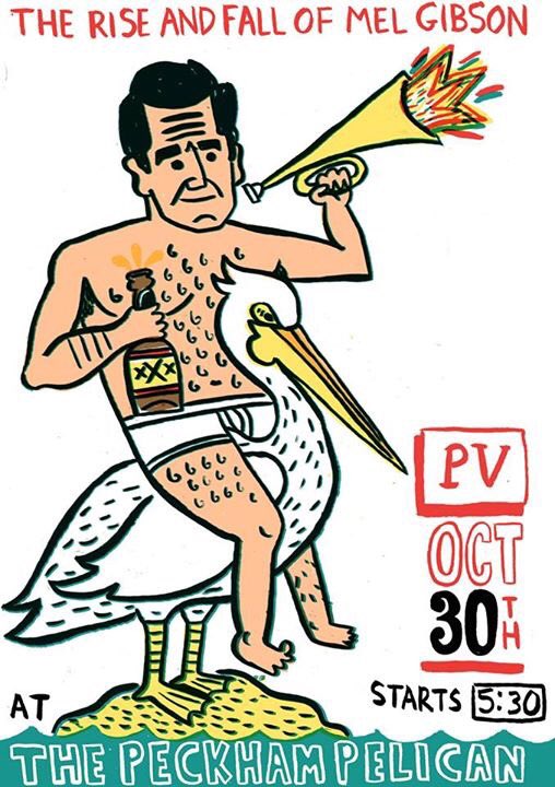
Mel Gibson's Legs


Akin to hiring the least qualified and unsuitable candidate for a job, illustrator ZEEL invited me to write a piece for the book accompanying the upcoming illustration exhibition The Rise and Fall of Mel Gibson. Least qualified as I had never even seen a Mel Gibson film before ZEEL asked me. Under strict laboratory conditions then, with my hand hovering over a red alarm button in case of emergency,  I was exposed to the film What Women Want, an American Romantic Comedy from the year 2000. How a Norwegian fisheries scientist/ film buff got into the mix, I don't know.
The flyer is designed by Aidan Saunders, who organised the exhibition together with ZEEL.


Mel Gibson’s legs

I’ve come to Norway to do some research into Mel Gibson and his seminal film, What Women Want. Although the film came out in 2000, and was quite popular in Norway that year, incredibly, fifteen years later, it is still the highest grossing film here. At the Oslo Film Foundation, recent research has revealed that the average Norwegian has seen the film 13.3 times.

Sometimes films get lost in translation when they cross the Atlantic, but in this case the film bound for Norway was actually lost. Ragnar Holst Sørland, a fisheries scientist, was given the task of importing What Women Want. He had made a series of highly successful films of fish for television. In Norway people love to see slow, contempletive films of trains going from one side of the country to another, for example, or rain pattering on a corrugated iron roof, or twitching curtains, all in real time. The trouble was after Sørland’s astoundingly low key film Fish Sleep Too the genre seemed to be exhausted.

But what does all this have to do with What Women Want, a film about a chauvinistic advertising executive, played by Mel Gibson, who electrocutes himself in the bath and suddenly is gifted with the ability to hear women’s thoughts? Surely that couldn’t be boring? It’s true, Sørland was pretty disappointed when he saw this film. He had never done product placement, but this film was practically an advertisement for Nike. They even had Nike executives play themselves in a key pivotal scene. He didn’t like scenes with pivots either. The protagonists in his film were fish of the most easy going nature, so would blow any rampant egotistic alpha male like Gibson out of the water.
As he sat through the film in Gibson’s own private screening room in LA, he had to stifle yawns. In one scene, Gibson was supposed to be sampling products aimed at women such as lipstick, leg wax, and mascara, to get insight for a pitch to his advertising boss the next day. Instead of putting his mind to it, he wastes his time drinking red wine and dancing around his apartment to Frank Sinatra. He even rips a decent pair of tights. Ragnar tries to understand the premise of the film. Why doesn’t Nick Marshall respect and understand women in the first place? Why does he find having a female boss a problem? Don’t they have a women’s quota?

After turning down Gibson’s offer of a part in his latest movie as a Norwegian fisheries scientist, Ragnar makes his excuses and leaves with Sinatra still ringing in his ears. Gibson’s film stinks like Surstrømming, but Ragnar has the film board to answer to. Ragnar comes to a decision. “I’ll do it ‘My Way”, he says. “Not for me though. For my fellow citizens.”

On the ship back to Norway, Ragnar has just six months to rework the film. In his tiny cabin he works with scissors and glue, cellophane and burned matchstick heads to recreate a film that could just merit his journey. After four months he pauses to look out the porthole, then resumes his work. 

The Oslo Film Foundation screens What Women Want. It is a 24 hour frame by frame version of the scene in which Mel Gibson waxes his right leg. The part that Ragnar finds particularly successful is the four hour scene of the wax heating up in the sink in its little tub. How that scene was wasted before in a matter of a second? The scream Gibson emits when ripping off the wax strip now has a spiritual quality. Slowed down, it is hard to tell if there is really one tone or more, but at times it sounds like a Mongolian throat singer, uplifting.

Pleased with his work, he decides to set off on a vanity project, ‘sink or sink’, a film about a carp's journey to the bottom of a pond. He has also made a friend across the pond. Mel Gibson has agreed to introduce him to a friend or two in Hollywood. Maybe they will knock out some slo-mo films together, as Mel calls them. They even have a working title: What Fish Want. 


by ZEEL


A video of a flick through preview of book:


Sunday, 16 November 2014

Narrative Takes: More Pictures in the World...


This is part one of a talk I gave at the Democratic Photo Club held at Stills Gallery in Edinburgh on November 6th. Members are invited to set a theme for others to interpret through photography with a talk, discussion and show of members work. For November I chose the theme of NARRATIVE TAKES and was interested in artists who create tensions between reality and fiction in their work challenging our conventional scripts. To introduce the theme I told two stories of my own inspired by the artist Thomas Demand. Here is the first story including a short intro on Thomas Demand.


I first saw the work of Thomas Demand at the Serpentine Gallery in 2006. Living in Berlin at the time, the fact that he was German and living and working there and of my generation were other factors that attracted me to seeing the show. Apart from that, London is my hometown and a gallery visit was a way for my Dad and I to spend time together, to structure and frame our somewhat difficult relationship. On a basic level it was something to do.
Staircase, 1995, C-Print/Diasec, 150 x 118 cm


When you first see a work by Thomas Demand, you may think it is a straight photograph of a scene or interior. As sources for his ideas he uses found or archive photographs and also personal memories. He constructs a life size model from paper and card which he then photographs again. After the photo is taken, the model is destroyed. It is only when you look closely that you realise the deception, that the photograph is lacking certain details or appears too perfect.

Klause/ Tavern 2, 2006, C-Print/ Diasec, 178 x 244 cm

You naturally begin to create a narrative from your own associations with the place/image in front of you. But even when you know the  story behind the image if there is one at all, you realise the world Demand has created doesn't exist, that it is fake and constructed. How reliable then are the narratives you choose in your everyday life and the ones you see in the media?

Office, 1995, C-Print/Diasec, 183.5 x 240 cm
When we arrived at the Serpentine, we saw that the walls of the gallery were covered in hand-blocked ivy themed wallpaper, in four colour tones to reflect different times of day. Normally you would expect art photography to be placed on a white wall. There appeared to be a deliberately stark contrast between the handicraft of the wallpaper and the apparent slickness displayed in the large photographic images.
Installation view, Serpentine Gallery, 2006 by Nic Tenwiggenborn


Copyshop 1999, C-Print/Diasec 183.5x 300cm


A 3 metre wide photograph in the exhibition called 'Copyshop' shows at first sight that: A ubiquitous space filled with photocopiers. There are no logos on the machines or paper. An impersonal space has been further stripped of clues. The photographic image of a photocopy room would appear to be the very antithesis of the process of handicrafts. Infact, by using the same material as a photocopier, paper, to make the somewhat banal scene in front of us Demand raises questions of reproduction, originality and the intrinsic worth of objects and images themselves. It is in itself a narrative that resounds through the gallery space, partly absorbed by the textured wallpaper, bouncing lightly off the glass surface of the photographs until it reaches us, where it will fall upon us to listen to our associations with the spaces that no longer exist or perhaps only once existed as an idea in paper that Demand once created. 


Hand-Blocked Wallpaper from the exhibition


After the show, I wanted to buy a book on Demand’s work. A disagreement began between my Dad and I about buying the show’s catalogue. My Dad thought it was too expensive and bought me another Demand book from a past exhibition:


 We had even walked away from the Serpentine  into Kensington Gardens and along the lake when I realised I really really wanted the exhibition catalogue as well as or instead of the other book. I was an adult but also the spoilt little girl with her Dad who felt she had to get what she wanted. Sometimes I hate this trait of mine, I get seduced by an exhibition and feel I must have “it”, whatever that thing is. I guess I am not alone in this as I have noticed the gift shops getting bigger in relation to art galleries and museums spaces. Anyway, I convinced myself that I couldn’t live without this catalogue, as it had pieces of the original wallpaper stitched into the book and was of the exhibition I had actually seen. Why couldn’t just seeing the exhibition be enough? I got my way, and we headed back and soon the issue of money seemed to loom up large between us. I felt embarrassed now as it turned out my Dad had only wanted to buy me something and he had. I also felt his dissaproval keenly that I wanted to spend more money which we both knew I didn’t really have on something that was in his eyes - unneccessary.

 In the midst of our discussion on the gallery steps, a man approached us and said he was a patron of the Serpentine and as such could get us a discount on the catalogue. (We must have been attracting attention). He accompanied me to the sales desk and I bought a catalogue for myself that my Dad still thought was too expensive even with a discount and was more expensive than the one he had bought for me.

It seems so poignant to me that this personal narrative has formed alongside the many narratives of the exhibition itself.

Now turning the pages of the book eight years later I see that the back of one piece of wallpaper has tiny circular ink flecks and mottling soaked through from the front of the paper itself.


This is echoed on the next page in “Constellation” an image of how the night sky would appear exactly 300 years into the future.
Constellation 2000, C-Print/Diasec, 130 x180
With this photograph, Demand defies the logics of photography that it is supposedly telling us a narrative that is always about the past. At every new exhibition space he reconfigures the image again so that it creates an image at that space exactly 300 years into the future. 

Images, whether taken by us or present in the media become part of the landscape of our past. Thomas Demand literally punches holes in paper to make this photograph of the night sky and in doing so he also punctures the façade of these narratives. A projected constellation of the skies has no stories only the ones we choose to project upon it. I see this photograph as something wholly unemotional. I think that is what Thomas Demand does with the photographs and constructions that he makes. He takes out the detail, creates a certain vacuum lacking in emotion. In doing so he reflects upon and lays bare our own personal and cultural associations and ironically, emotions.

Again, there is a twist to the story of this photograph. We are not seeing an image of the future at all but one of the past. The projected constellation is of light travelling towards us is from a million years ago due to the speed of light. We are not dealing with nice human distances of miles and kilometres either, or digestable human nuggets of time we frame our small stories within. Therefore to project any sentimentality, emotion or stories onto it is absurd.  Still, we do it.

I am writing this about eight years after visiting the Serpentine Gallery with my Dad. I can still touch and look through the catalogue in front of me. I am glad I bought it, as it brings back happy memories as well as being a beautiful object. This is even as I recollect with a certain embarrassment the situation under which the catalogue was purchased. This small story echoes many other stories that played out between my Dad and I, each incident not allowed to be isolated or played out alone but heavily loaded just like a Demand photograph. Now, just eight years later, a small human scale of time, I can only remember my Dad through the photographs and memories I have of him, and now this story.


(More images and information  on Thomas Demand available on his website)


Sunday, 23 February 2014

nur Bahnhof verstehen


The late shift at the Hamburger Bahnhof, a contemporary art museum in Berlin, which I visited last week. Money is being counted, the guards are rubbing their eyes, and I have the daunting task of  seeing all the collections and temporary exhibitions in just half an hour.

In the museum's Historical Hall, Berlin based Scottish artist Susan Philipsz has drawn on the former function of the museum building as a train terminus to create a sound installation "Part File Score" about the Austrian composer Hanns Eisler and his "moved life". Alongside his close friend Brecht, Eisler's music was banned by the Nazis in the 1930s and Eisler was forced into exile, finally getting a visa to the USA in 1938. He was deported from the US in 1948 accused of being a Communist agent. The artist has placed overlaid documents about Eisler by the FBI over his musical scores on the walls, and loudspeakers on the 24 pillars play single notes in succession from Eisler's film compositions. You don't know from which direction the next note will come. It disorients, surprises, and the fact that space is so big and empty makes you question your position.

It is interesting that Eisler's political beliefs informed his musical direction and that he consciously moved away from the twelve tone technique he had learned as a disciple of Schönberg to write more  popular film and theatre music, which he saw as more fitting to his socialist political beliefs. On his return to Germany, he also composed the GDR national anthem. He was accused, however, of plagiarism as the first four lines are similar to a popular song  "Goodbye Johnny" written by another Austrian composer, Peter Keuder, for a German film from 1939, "Wasser für Canitoga".

In this popular song the protagonist is saying goodbye to his best friend, a soldier who has fallen at his side in the war. When the main refrain of this song begins the singer switches from German into English, "cheerio, cheerio cheerio". Through its repetition and rhythm, it is reminiscent of a train starting up or a whistle blowing before departure before rolling into the chorus with  "Goodbye Johnny, Goodbye Johnny..."The lyrics include (in German) "I have to carry on. Always moving forward. Following my fate, my luck". The singer is dreaming of a "reunion" with his lost comrade in "heaven or hell" (he doesn't know which), and dreams that "in a hundred years everything will be over".

The themes of separation and unification are also heavily present in the lyrics of the GDR anthem  by poet Johannes R Becher ,which Eisler wrote the music for. There is no "hell" but a kind a type of heavenly utopia with people uniting in a new Germany of the future where "Triumph over bygone sorrow can in unity be won, for we shall attain a morrow when over Germany there is radiant sun". Apparently Eisler wrote the music for the GDR national anthem on the train journey from Austria to Germany after his return from the USA. Perhaps he was also thinking of his personal "cheerios" or maybe he was thinking optimistically about his new future in Germany, his reverie thriving in the space between departure and arrival.

In the exhibit, the overlayed images of Eisler's musical manuscripts with bureaucratic documents  contain two forms of language: musical notation, which is incomprehensible for those who cannot read music, and bureaucratic notes, full of errors in part and equally incomprehensible as a means to judge and quantify a life. In addition, swathes of black ink censors information and erases pencilled notation and staves. Standing in the Historic Hall, the work brings to mind the German phrase "nur Bahnhof verstehen" which in its literal sense means "only understand train station" but commonly means "you cannot follow or understand what is being said".

According to Wikionary this phrase has its origins in the first world war, in which Hanns Eisler was a soldier:

The soldiers apparently were tired of fighting and wanted to return home. Since the primary means of transportation was by train, many soldiers associated the train station (Bahnhof) with returning home. As the soldiers were preoccupied with returning home it could happen that they could or would not follow the conversation because they "only understood train station".

It also adds that the phrase can also mean when someone doesn't want to understand what they are hearing, they ignore it by saying the phrase in part to annoy the other person.

A play on words by the author "Hans Fallada" from the book "Wer einmal aus dem Blechnapf frisst" has a dialogue between two people also using the phrase:

"I only understand train station", he says.

"Train station isn't so bad when you need to make a getaway" she replies,  subverting it back to its actual meaning.

In art galleries and museums I often feel the visitor is being tested about how much they understand the art or whether they "only understand train station". In this exhibit and in this particularly accessible contemporary art museum the latter is perfectly fine.







Tuesday, 30 October 2012

Home is where the heART is


"Home is where the heart is" the saying goes. But at the Trailing Spouses Art Collective, we have discovered this past year that "Home is also where the heART is"! We are a group of 13 women who have all come to live in Bielefeld in Germany because of our partners' work. The group, which was initiated by Finnish artist Piia Rossi, has allowed us to creatively explore issues facing trailing spouses: lack of community support, loss of identity, loss of former careers, relationship problems, bureaucracy jungles and difficulties of finding new childcare and schools for our children, for example. 
In our exhibition, Home is where the heART is, we show work produced over the year since our founding in October 2011. We transformed a utilitarian space at Bielefeld University into a cosy living room, using our own spare furniture and furnishings, literally inviting visitors into our home to have a coffee and home made biscuits whilst looking at the art work. We wanted to make the visitor them feel at home, but also ask them to question what home means for a trailing spouse.
suitcases and packing boxes as plinths


paper houses on the theme of Investment


Open suitcases placed upon moving boxes became plinths displaying projects such as the paper houses on the theme of Investment. This project asked the question: If you move to a new city, knowing in a few years you will have to move again to follow the work, how much love, money and energy can you invest in your home? I took my odd key collection, and made a rubbing of the keys which I printed on my "house".  One key was from Berlin, reminding me of my former life there. I have no idea which objects I will be able to take from my real house when we next move, which could be within the next year, destination unknown, depending on next job offer.


Another suitcase displayed the Trailing Spouse self portraits as paper dolls. Grace's doll was made up entirely from Ikea catalogue cuttings. Not very personal, but the practicalities of settling into a new city  sometimes prohibit that.  

Reka adds the finishing touches to exhibit


The photographic portrait series "Faceless"  looked at how identity is effected by arriving in a new place, not knowing anybody and not knowing the language. Patty's response was a photo called "Nobody wants to play with alien chicken".
Nobody want to play with alien Chicken 


Pieces were also hung from threads from the ceiling, hankies printed with our "mini sagas" and paper lanterns with our "Elfchens".


Our hankies  tell a mini saga


tea amongst the Elfchens


There was even our Manifesto which was aptly displayed in the form of a packing box.

put your feet up and feel at home


People were also drawn to our new website, MyBielefeld on the beamer, with Olga's beautifully hand drawn Bielefeld skyline forming the banner. We started this website to help new arrivals in Bielefeld who may have problems with the language. Categories range from eating out to health issues to finding a flat.


Sam gets in some knitting time.


The exhibition's location at the University was also important, not only because some of our partners work there but also because the structure of academia itself creates huge pressures on individuals and families and does little to support them. As a friend put it, it is like working as a diplomat, i.e. having to move every four years, but without the perks. There is a very good article in the guardian about this.
cookies going fast


A few of us have moved away since the Trailing Spouses Art Collective started and a few more have joined. I hope that we can continue finding out if Home is where the heART is for a good while to come.